 O.K. Computer
Written by: Kyle HigginsArt by: Stephen Mooney
Colors by: Jordie Bellaire
Letters by: Clayton Cowles
Publisher: Image Comics
Publication Date: August 8, 2018
I gotta confess. I've been a little worried about this book. It's not that the story was getting worse, or that there was a significant dip in the art. My spider-sense was, however, starting to tingle a little across the last two or three issues. The book was enjoyable but was about to hit that point at which it had to hit the next gear or it would be in danger of fizzling out. What would happen? Let's find out.
Great news, this issue hit the next gear. The art was impressive. It had as its focus the trio of Carter, Harriet, and Renae. There is a real chemistry and tension being built up between the three here, with questions being resolved around Roger. A very clever use of the reveal. The net is tightening on the whole set up down there on Mountain view with threats both internal and external. Higgins plays the game brilliantly.
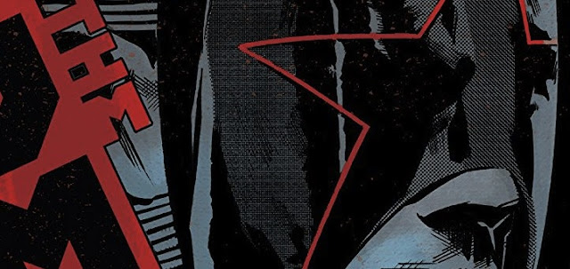
Likewise, the art and colors in this issue are really excellent. The use of whole color pages with shades and tones is effective here. Also, the character shines through each of the leads. I thought the depiction of Harriet's incredulity at points was particularly effective. Good to see after a few little rough patches in the art in previous issues. This issue hits it out of the park.
Bits and pieces
This issue picks up the pace and really injects a sense of urgency into the story. The artwork has no little patches of rushed art or ineffective coloring that has occurred (albeit only briefly) in parts of the last two issues. This is the best issue since the first installment and puts this book back on top of the Image Comics pile for me.


No comments:
Post a Comment