I tell ya, it's either feast or famine around here! Last week, I struggled to put together a list of five best covers coming from DC Comics, and this week I had to cut a couple to shape things up properly! Not to mention there were like a skillion variants of Justice League #1. I only picked two, though. Read on to find out which ones!
Green Arrow #41
Tyler Kirkham
You won't have to twist my arm to get me to look at some of Tyler Kirkham's artwork, and I love the way he drew the Parasite here. He's got those gross tumors coming out of him, the way Aaron Kuder drew the character during the New 52. The negative space here exacerbates the composition, as well as making this image suitable for a sticker.
You won't have to twist my arm to get me to look at some of Tyler Kirkham's artwork, and I love the way he drew the Parasite here. He's got those gross tumors coming out of him, the way Aaron Kuder drew the character during the New 52. The negative space here exacerbates the composition, as well as making this image suitable for a sticker.
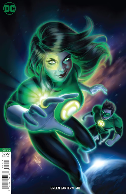
Green Lanterns #48 variant
Brandon Peterson
This looks sort of like that cgi Green Lantern cartoon, which I miss a lot. Jessica smiling in the foreground while Hal scowls in the background implies some kind of interesting story beyond "two superheroes on a comic book cover." The background looks sweet as hell, too.
This looks sort of like that cgi Green Lantern cartoon, which I miss a lot. Jessica smiling in the foreground while Hal scowls in the background implies some kind of interesting story beyond "two superheroes on a comic book cover." The background looks sweet as hell, too.
Deathstroke #32 variant
Francesco Mattina
Here's a great use of the Bat Signal, Deathstroke style. This cover gives me Batman R.I.P. vibes, but I'm not sure why. I'm just a sucker for an image that uses a few colors really well.
Here's a great use of the Bat Signal, Deathstroke style. This cover gives me Batman R.I.P. vibes, but I'm not sure why. I'm just a sucker for an image that uses a few colors really well.
Justice League #1 variant
Clayton Crain
There was another variant by Clayton Crain that was essentially this, but only Batman and Starro were there. I actually liked how that was colored better, but this one wins because 1) more heroes, 2) old-school series logo, 3) old-school publisher logo. It's a great take-off of The Brave and the Bold #28 in either instance, reminds me of the fake book cover from Kingdom Come.
There was another variant by Clayton Crain that was essentially this, but only Batman and Starro were there. I actually liked how that was colored better, but this one wins because 1) more heroes, 2) old-school series logo, 3) old-school publisher logo. It's a great take-off of The Brave and the Bold #28 in either instance, reminds me of the fake book cover from Kingdom Come.
Justice League #1 variant
Ben Oliver
There's something very mid-century science-fiction mass market paperback about this. I feel like this must be an homage to something, but I don't know what. The image haunts me. The watercolor coloring, the composition...this gives me the impression that the contents beyond the cover are important.
There's something very mid-century science-fiction mass market paperback about this. I feel like this must be an homage to something, but I don't know what. The image haunts me. The watercolor coloring, the composition...this gives me the impression that the contents beyond the cover are important.


No comments:
Post a Comment