 Written by: James Stokoe
Art by: James Stokoe
Cover Price: $3.99
Release Date: April 26, 2017
Publisher: Dark Horse
Review by: Repairman Jack
**Score and Non-Spoilers at Bottom**
My timeline with the Aliens franchise has been a little backwards. I remember seeing a lot of the third and fourth movies on cable when I was younger and never really cared for them, but I eventually came around to the first two movies and gained an odd appreciation for the series. I wouldn’t say I’m an enthusiast or a huge fan of the series, but I was definitely interested in this book when it came across for an advance review. With art and story from James Stokoe, Dead Orbit promises to be a thrilling and claustrophobic tale, so let’s find out how this first issue does.
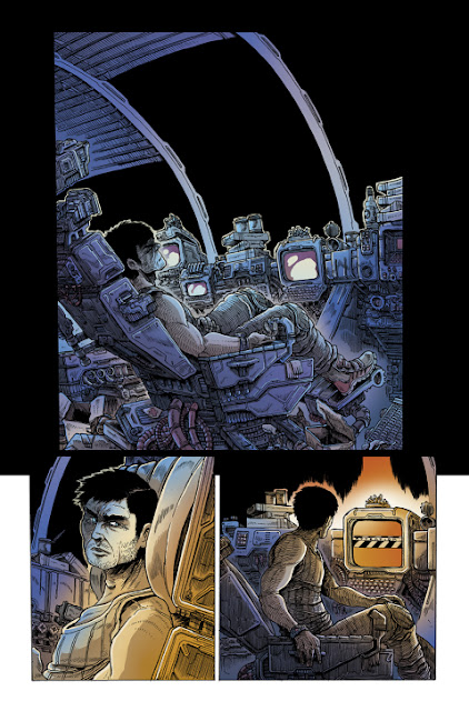
We first start with a space station, by the name of Weyland-Yutani Sphacteria, in complete destruction. It seems like something catastrophic happened to half of the station at some point and the debris is left to float out in space. Right away the art is pretty striking. I’ve lately had a bit of a low streak with creators handling writing and art on their book, but this book definitely doesn’t disappoint. I’d usually say the art was cluttered and overly detailed, but I actually think it adds a nice effect to this book. Somehow the 80’s futuristic look comes across in this art. I’m instantly reminded of some sci-fi manga or anime from the 80’s like Bio Booster Armor Guyver or Akira.
We get a few wordless pages as we meet a character who comes across as he’s been through some shit. He’s out of smokes and forced to deal with a danger sygnal that needs his attention with a four hour window. He sets off for his task and eventually heads out in space where he gets a sight of another ship which kicks off a flash back that really starts the story off.
With the flashback we learn that our previous character, now named Wascylewski(Wassy), is the engineer for aforementioned space station that had seen some better days. We get some nice team talk that does a nice job filling some exposition and giving us an overall feel for the hierarchy of the crew. We also learn that another ship eventually comes along with differing opinions among the crew as to its inhabitants. With of course no call coming from the ship they eventually decide to make excursion across to see what's going on as they’re still seeing heat signatures.
Although it’s a pretty well tread set-up it does well coming across seamless enough. I mean there is only so many ways you can come across a ship floating out in space. It’s around here I’d really like to sing praise for the art. It is ridiculously detailed and does an amazing job of really coming across as claustrophobic. You really get a sense of everything being absolutely crammed into these vessels and the coloring just does a phenomenal job at selling the dread and darkness on top of it. I can only imagine the balance between detail and coloring was a tight rope to toe.
With the crew making the trek to the other ship they get some bad signs but of course trudge on to finally come across three of the ship's crew in cryo-sleep. With the rescue having some eventual difficulties we cut back to Wassy on his original task. I don’t want to spoil much, but I’d be remiss to talk about some nice touches of psychological fakeout. It does a good job setting up the idea that ole Wassy may just have gone through too much shit, and it may be setting us up for not being able to fully trust what we see from time to time. It adds a great bit of mystery to it and it really works for a great ending. It’s not over the top, it’s not anything revelatory, but it just adds an extra level of tension that gets me anxious to get to the second issue.
Overall I really loved this first issue. It’s a little heavy on the tropes, but does a fine enough job steering around them without them feeling too over the top and stupid. The art is phenomenal and really is a huge selling point for this book. Even if I ended up hating everything I read in this issue I think I’d be coming back for the art alone. The mix between 80’s feel, over cluttered and detailed art, and dark and brooding yet not too drab colors is really magical, and I’m risking sounding cheesy saying that because I truly think it is something great.
Bits and Pieces:
This issue could be entirely wordless and I’d suggest you go out and buy it for the art alone. With overly cluttered and claustrophobic art wrapped in dread filled beautiful colors it is absolutely masterful in setting a perfect tone for this story. The story is a bit tropey to start, but it does a fine job of steering around it and ends up adding some great touches by the end.
9.6/10


No comments:
Post a Comment